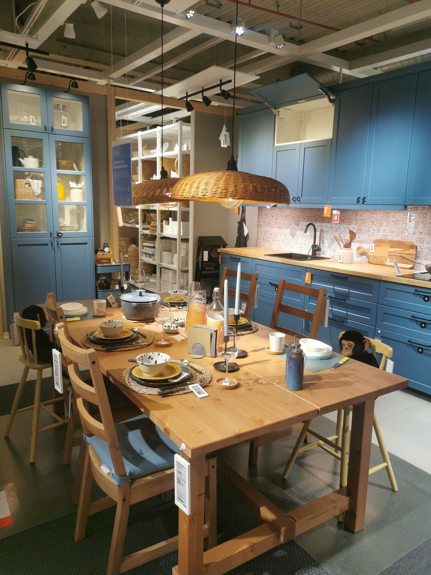
The LERHYTTAN kitchen in blue is one of IKEA's most character-rich kitchen fronts, blending classic craftsmanship with a slightly rustic, Scandinavian feel. During my visit to IKEA Stuttgart, I filmed two different LERHYTTAN blue kitchen setups, each showing a distinct interpretation of the same front.
Mustard, Navy, Pink, and Teal Wall Colors: The Bold Side of IKEA Kitchens
When designing a kitchen, most people play it safe with white, grey, or beige walls. But what if your kitchen could say something more? IKEA kitchens are known for their versatility, and as these real-life examples show, they can also be the perfect canvas for bold, unexpected color choices.
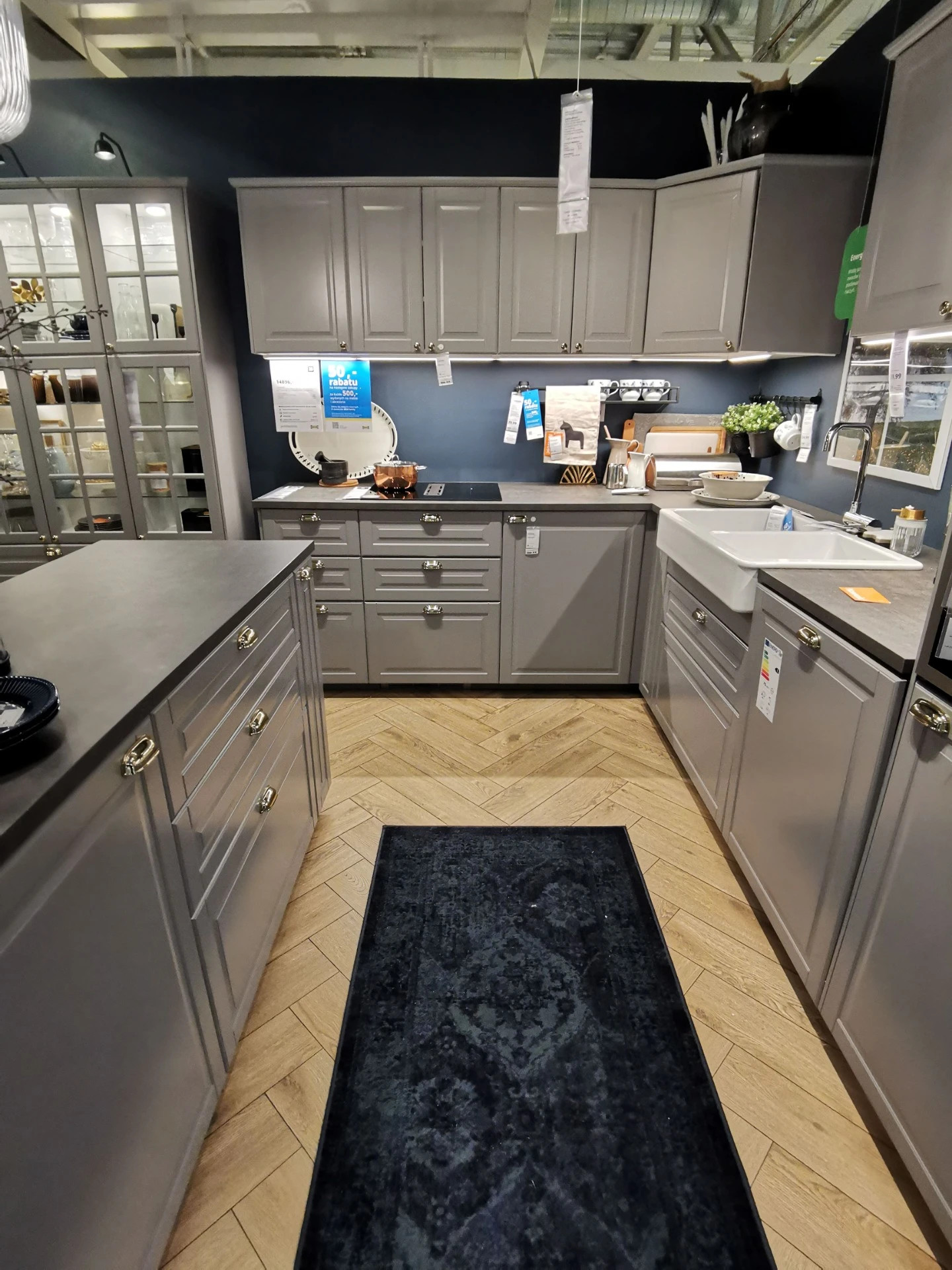
From deep navy blues to playful pinks, warm mustard yellows, and soft turquoise hues – these colors add personality, depth, and warmth to spaces that might otherwise feel too neutral. And yes, these are all real kitchens, photographed by me, Mauritz, during visits to different IKEA stores across Europe. What you'll see are not styled magazine sets, but actual showroom kitchens, filled with ideas worth borrowing.
Let's take a closer look at how these four bold wall colors bring IKEA kitchens to life – and how you can use them to elevate your own space.
Mustard Yellow Walls – A Radiant Match for Creamy and Light IKEA Cabinets
Mustard yellow may be an unexpected choice for a kitchen, but it delivers warmth, charm, and personality in a way that neutral colors rarely do. Paired with IKEA's off-white and beige cabinets, it creates an atmosphere that feels both nostalgic and design-forward. Let's take a look at how this golden tone enhances three very different kitchen setups – KNOXHULT, SÄVEDAL, and STENSUND.
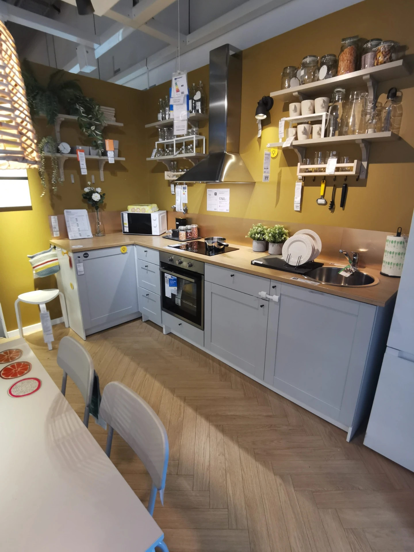
In the KNOXHULT kitchen, the mustard wall acts as a vibrant contrast to the light grey cabinet fronts and clean-lined design. Despite KNOXHULT being one of IKEA's most budget-friendly systems, this color pairing elevates the space dramatically. The yellow brings energy and brightness to the compact L-shaped layout, while open shelving, light wood flooring, and black hardware keep the look practical and urban. It's a great example of how even small, simple kitchens can feel thoughtfully designed with the right color choice.
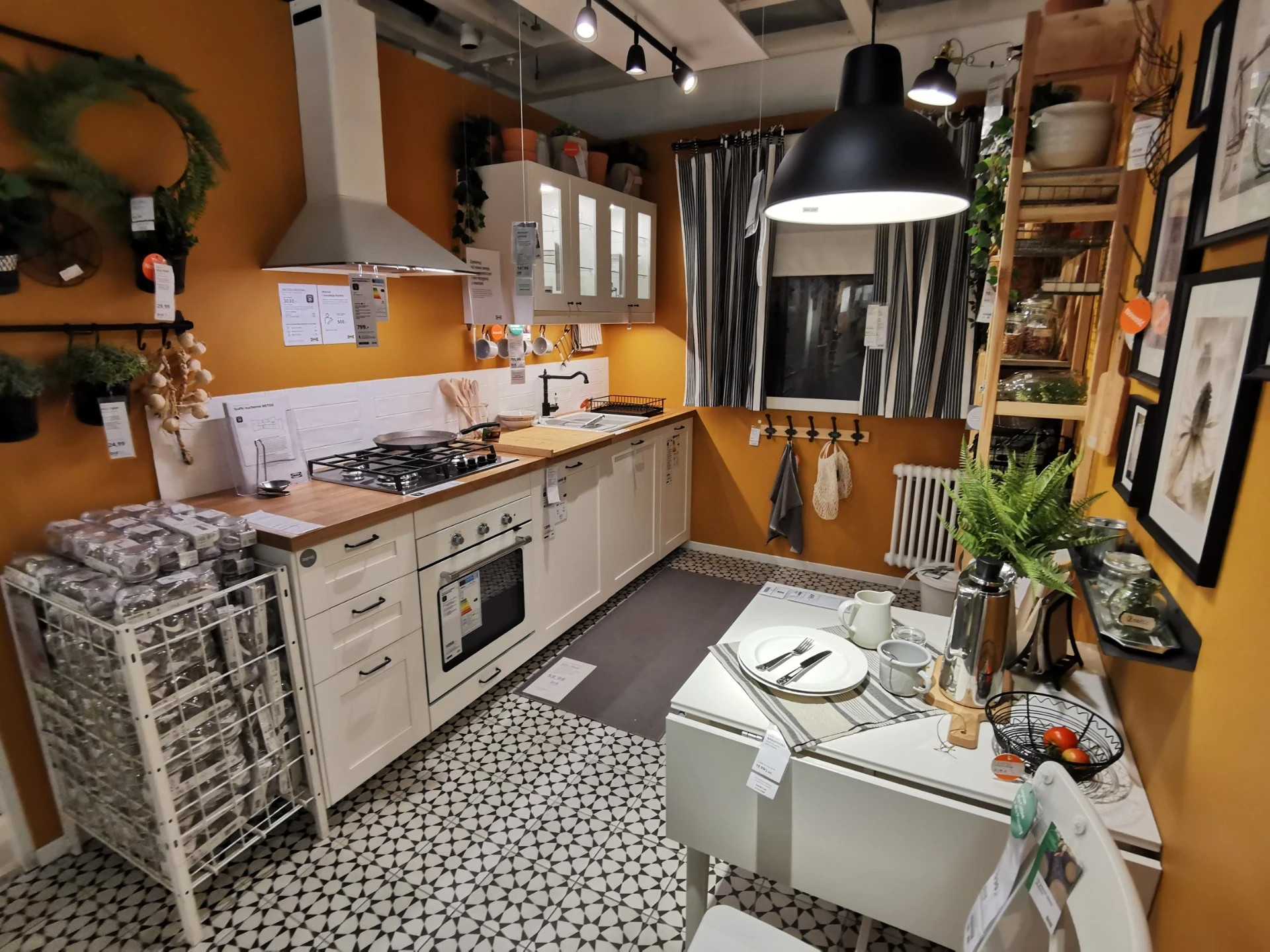
The next setup features the now-discontinued SÄVEDAL cabinet series – a classic design with creamy white, framed doors. Here, the mustard yellow walls are slightly richer and more muted, wrapping the kitchen in a warm, sunlit glow. Combined with natural wood countertops and black-and-white patterned flooring, the space captures a timeless farmhouse look. Black hardware and vintage-inspired elements like freestanding storage and curtains give it a welcoming, collected feel that still resonates with modern tastes.
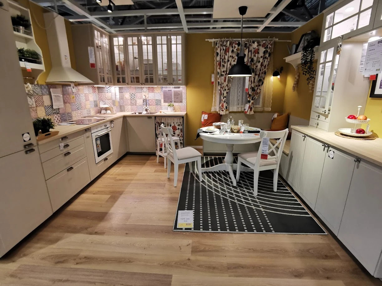
Finally, the STENSUND beige kitchen offers a balanced and elegant interpretation of mustard yellow. The cabinetry has a soft, warm tone that almost melts into the walls, and the color repetition across the backsplash and textiles creates a beautifully cohesive palette. A built-in bench with cushions, oak accents, and subtle traditional touches give this space a cozy cottage vibe, while still feeling current and fresh.
Mustard yellow is at its best in kitchens where warmth and charm are priorities. Whether you're working with high-end details or flat-pack simplicity, this color delivers mood, depth, and visual interest – all without overwhelming the space.
Warm Pink Walls – Adding Soft Elegance and Energy to Your IKEA Kitchen
Pink may be an unexpected wall color for the kitchen, but it can completely transform the space – adding charm, warmth, or a touch of modern playfulness. In this section, we explore three IKEA kitchens where warm pink tones set the mood: a romantic BODBYN design, a fresh ENHET layout, and a modern HAVSTORP/VALLSTENA combo.
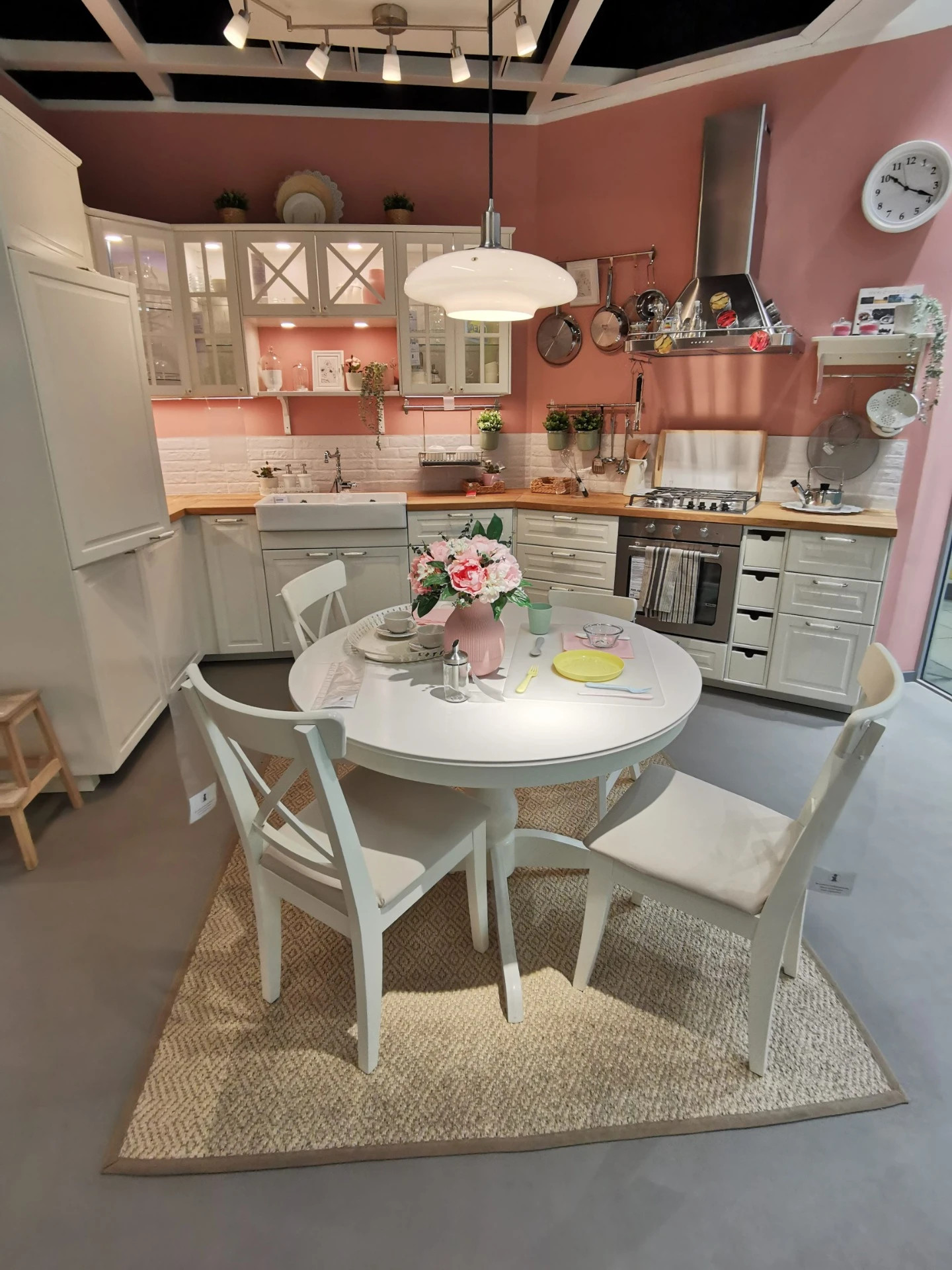
The BODBYN kitchen leans into a cozy, traditional look with soft dusty pink walls and off-white framed cabinets. The result is a kitchen that feels timeless, almost like stepping into a vintage countryside home. The pink backdrop brings out the warmth of the wooden countertops and the softness of the classic door design.
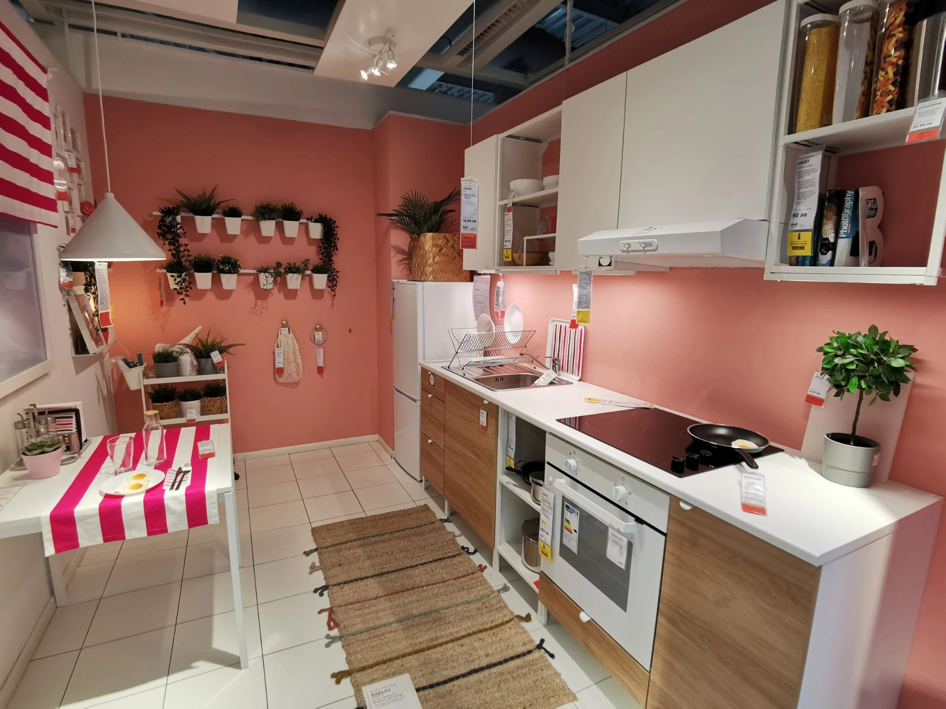
Next, the ENHET kitchen with open shelving and white/oak effect cabinets embraces a younger, livelier aesthetic. The pink walls here are a bit clearer and brighter, lifting the space and adding personality. This look is ideal for smaller homes or those who want to keep things fun and vibrant without overwhelming the design.
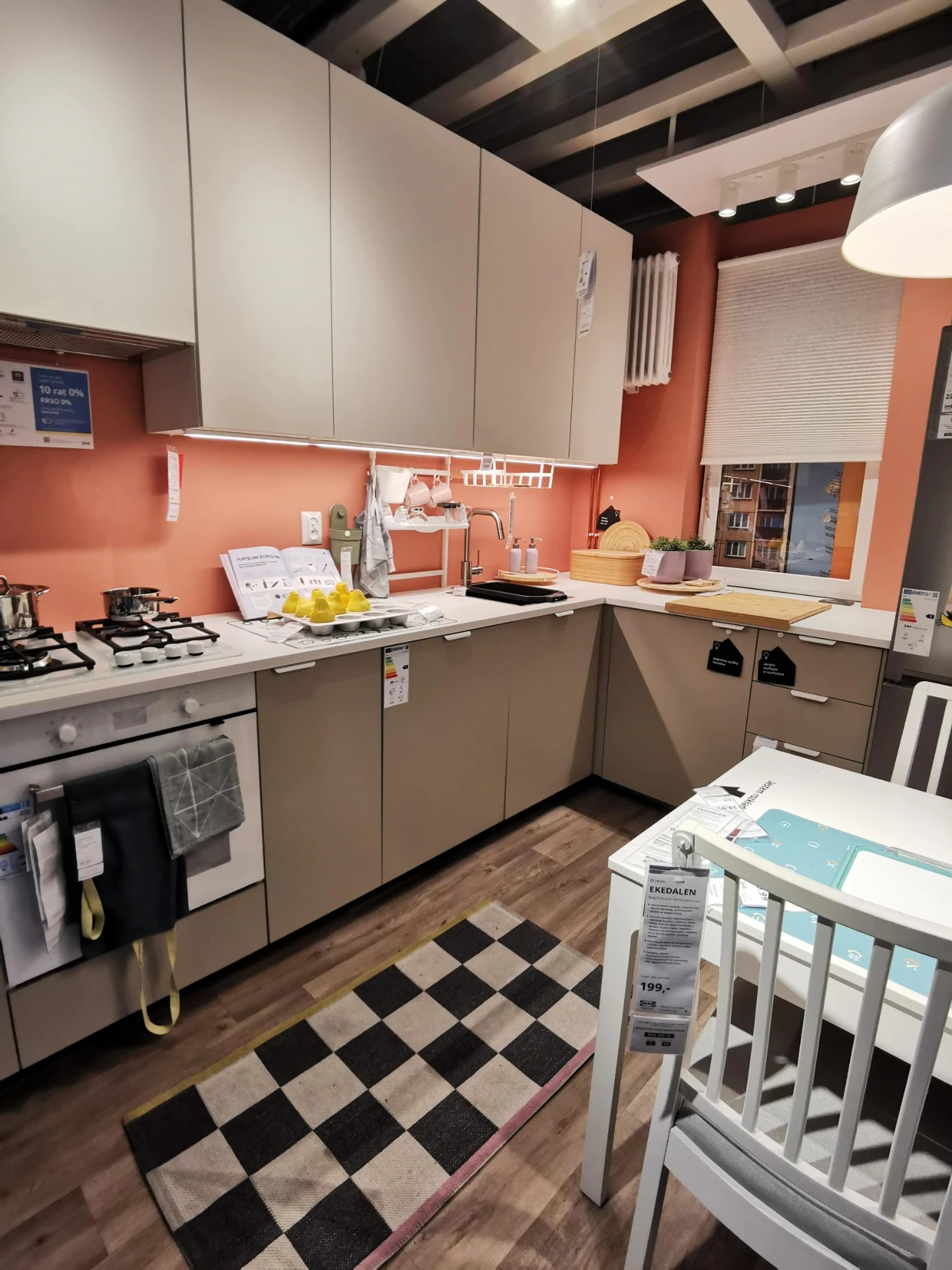
Finally, we have a sleek, modern pairing of HAVSTORP beige lower cabinets with VALLSTENA upper fronts, grounded by a muted terracotta-pink wall. This color bridges the warm base tones of the cabinetry with the cooler whites and metallic accents. It feels fresh, yet grounded – the perfect update for someone who wants a color accent that feels intentional, not impulsive.
Warm pinks work surprisingly well in kitchens – especially when paired with off-whites, wood tones, or soft greys. They create a sense of comfort and creativity, whether you're going for rustic charm or a more contemporary expression.
Turquoise Wall Colors – Cool, Calm, and Surprisingly Versatile in IKEA Kitchens
Turquoise may not be the first color that comes to mind when planning a kitchen, but it brings a refreshing sense of calm and individuality that few other hues can match. Whether you're leaning toward a beachy pastel or a bold teal accent, this versatile shade works beautifully in a wide range of IKEA kitchen styles.
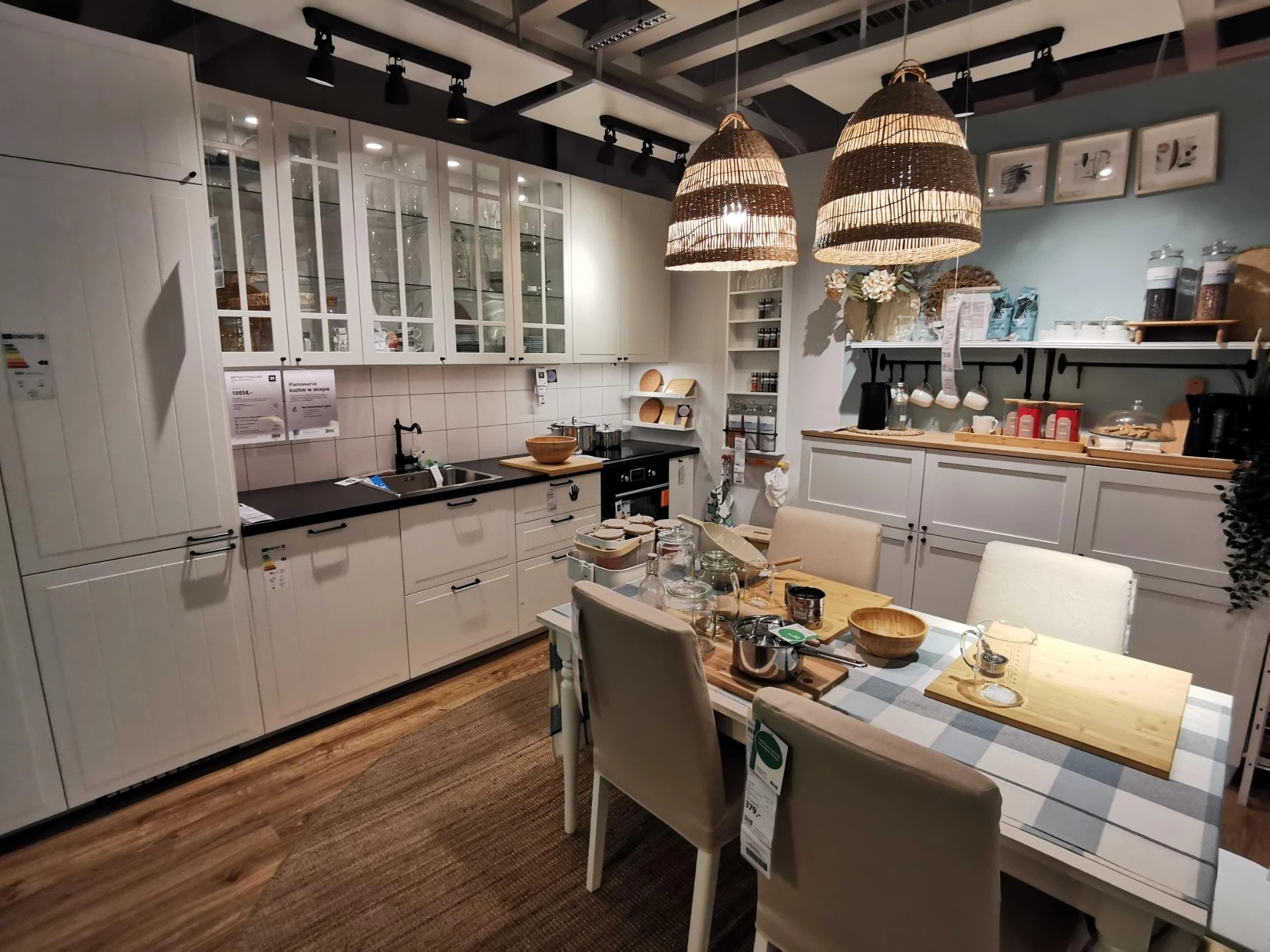
In the white STENSUND kitchen, a light pastel turquoise wall softens the overall look and adds a cheerful touch to the traditional cabinetry. Combined with wood countertops, white tiles, and rattan pendant lamps, the result is a bright and welcoming country-inspired space.
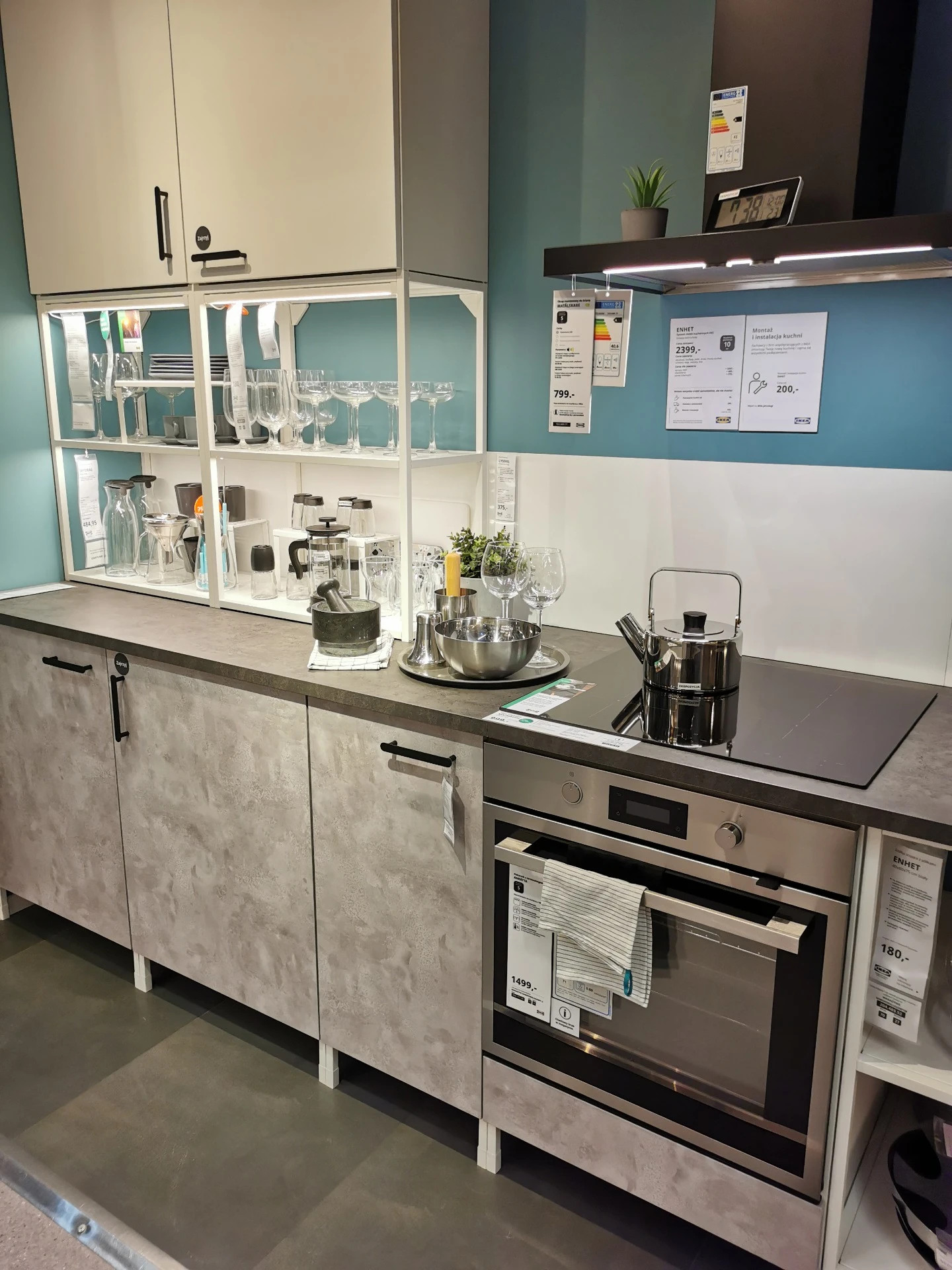
The ENHET kitchen offers a more urban take, using a slightly stronger turquoise to energize the minimalist concrete-look lower cabinets. The contrast between the cool wall color and the warm grey textures makes the entire setup feel intentional and modern without losing its sense of comfort.
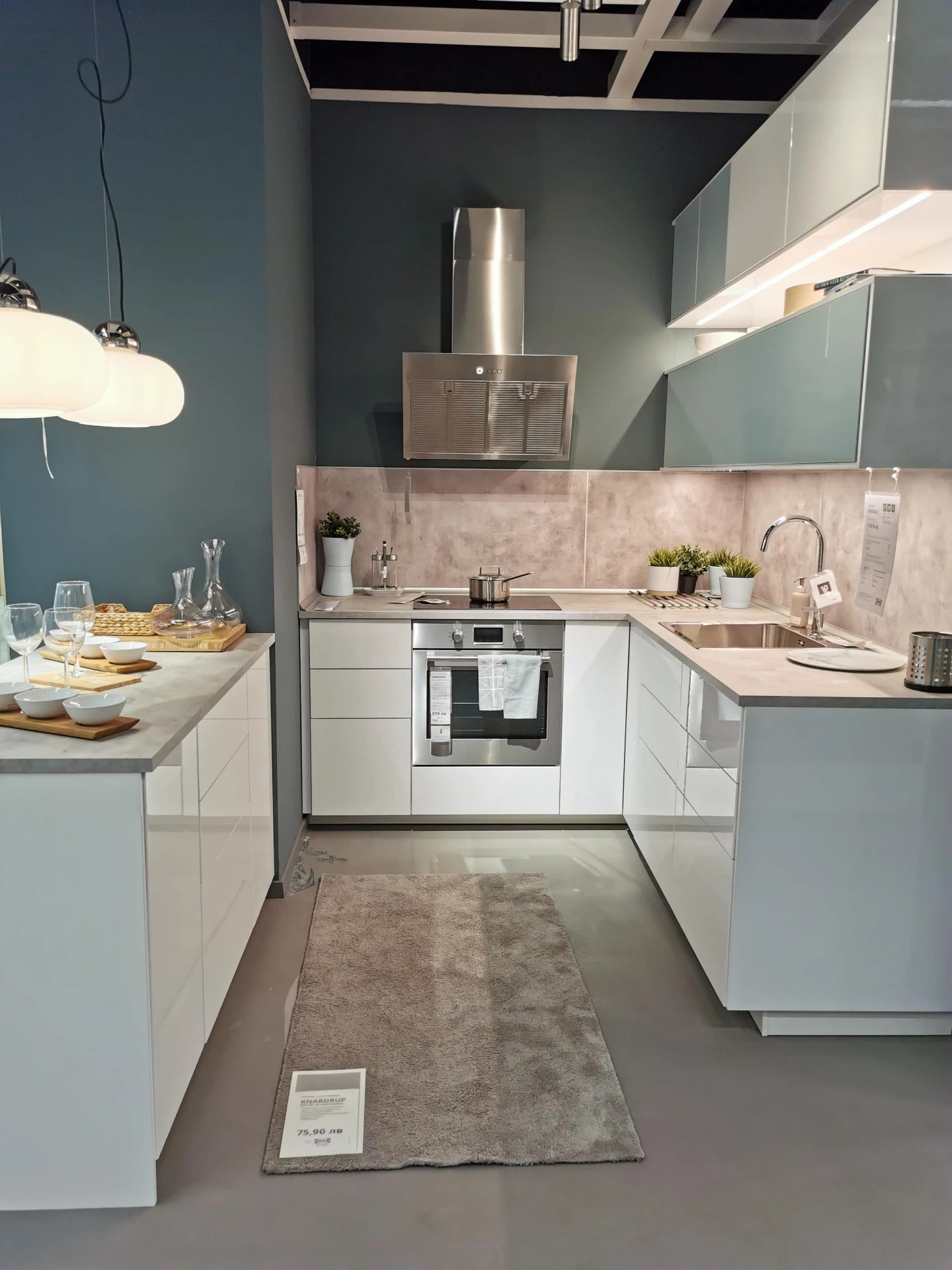
Lastly, a glossy JÄRSTA and RINGHULT combination features a deep teal-turquoise wall behind sleek, white high-gloss cabinetry. The effect is bold but balanced, creating visual interest and a strong design identity while preserving the kitchen's clean, uncluttered lines.
Turquoise tones bring personality without overwhelming the room. Whether you want a gentle, soothing vibe or a more saturated modern twist, these walls prove that blue-greens are far more adaptable in kitchen design than many assume.
Deep Navy Blue – A Bold and Sophisticated Choice
If you're looking to add depth and refined contrast to your IKEA kitchen, navy blue is a stunning option. We see it used beautifully in three distinct layouts – one traditional with off-white BODBYN fronts, one ultra-modern with glossy VOXTORP, and one with sleek grey BODBYN doors in a more muted and moody setup.
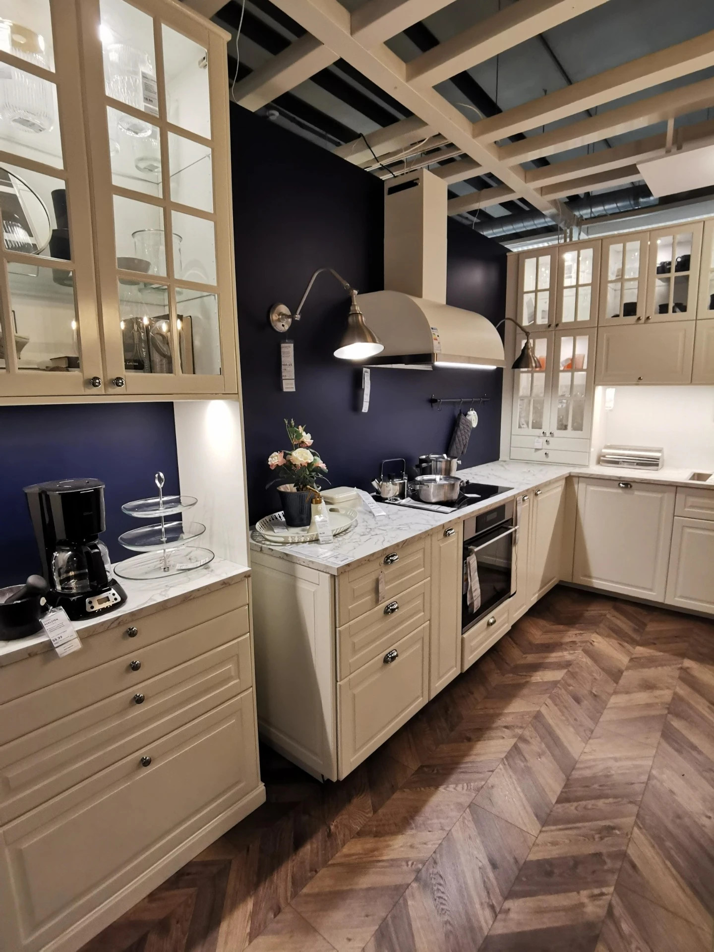
In the off-white BODBYN kitchen, the navy blue backdrop adds richness and character to the framed cabinet design. Paired with marble-look countertops and classic glass-fronted uppers, the space feels luxurious and timeless – a modern take on country style.
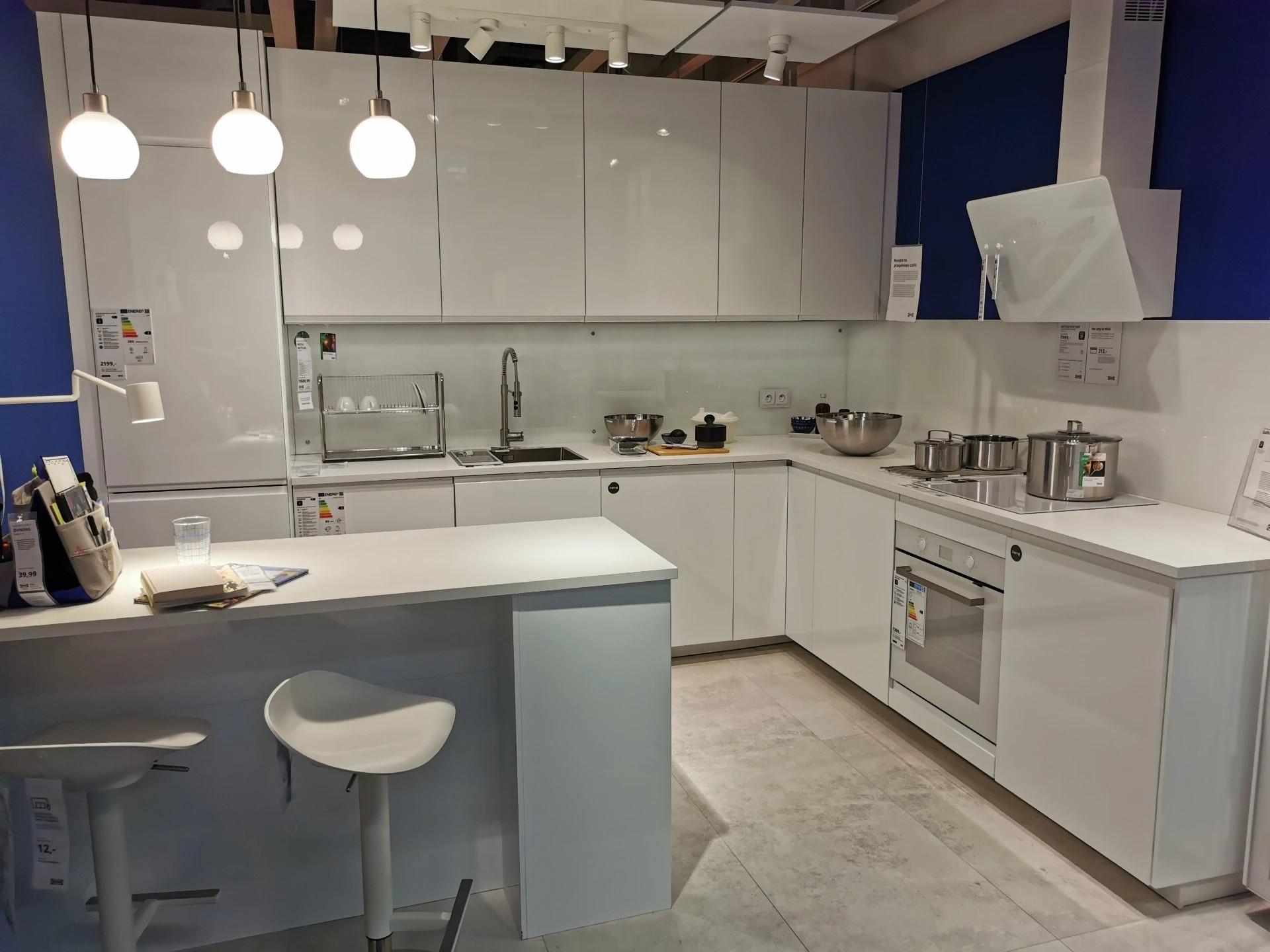
In the VOXTORP kitchen, the navy wall provides high contrast against the clean white gloss finish. The result is bold and minimal, perfect for urban spaces or anyone drawn to contemporary design. The color grounds the space while keeping it visually sharp.
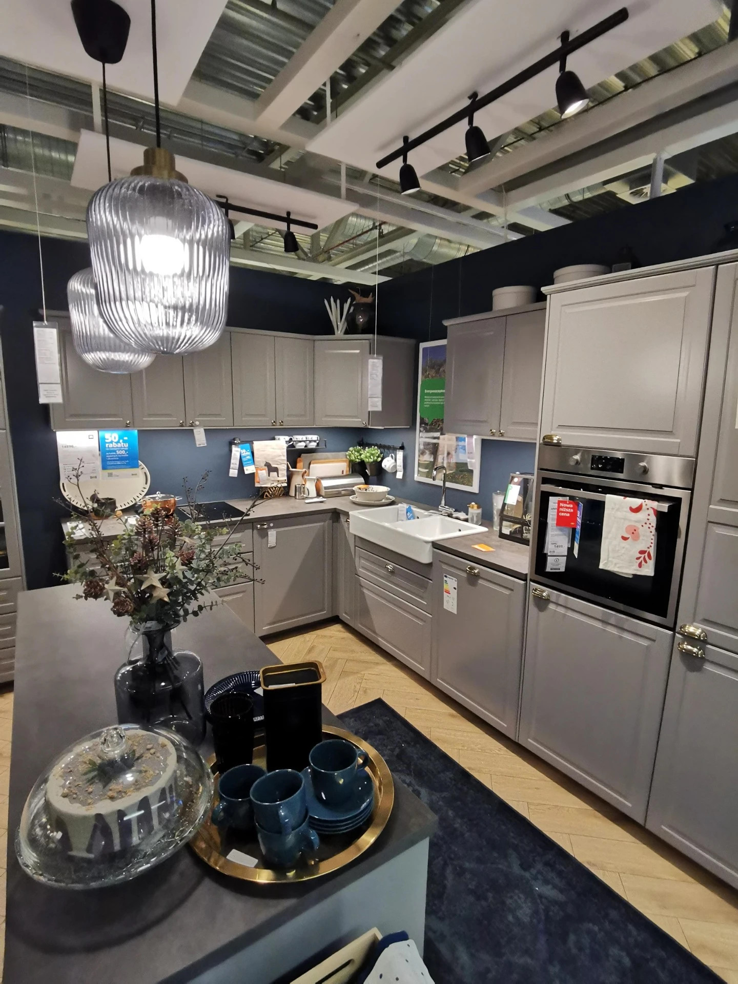
The third example introduces BODBYN in grey (NCS S 5000-N), paired with a darker navy wall that leans almost toward ink blue. The tone-on-tone contrast between blue and grey creates a cozy and cohesive environment, complemented by matte finishes and brass details. This setup proves that navy doesn't just work with white – it's just as elegant with mid-tone neutrals.
Navy blue works particularly well in kitchens where you want contrast without chaos. It pairs effortlessly with whites, greys, and natural textures, delivering a confident look that still feels grounded.
Bring Color Into Your Kitchen
Choosing a bold wall color can feel like a risk, but as these real-life IKEA kitchens show, it's often the small decisions – like paint – that make the biggest visual impact. Whether you lean toward the cozy warmth of mustard yellow, the elegance of navy blue, the charm of soft pink, or the cool calm of turquoise, there's a color out there that can make your kitchen feel uniquely yours.
And if you're still exploring ideas, I've photographed and documented over 140 IKEA kitchens from different stores across Europe – all real setups filled with color, detail, and inspiration. You can browse the full collection here:
Choosing the perfect kitchen system is one of the most important decisions when designing your home. IKEA offers two popular options: METOD and ENHET. While both provide stylish and functional solutions, they cater to different needs in terms of customization, durability, and budget.
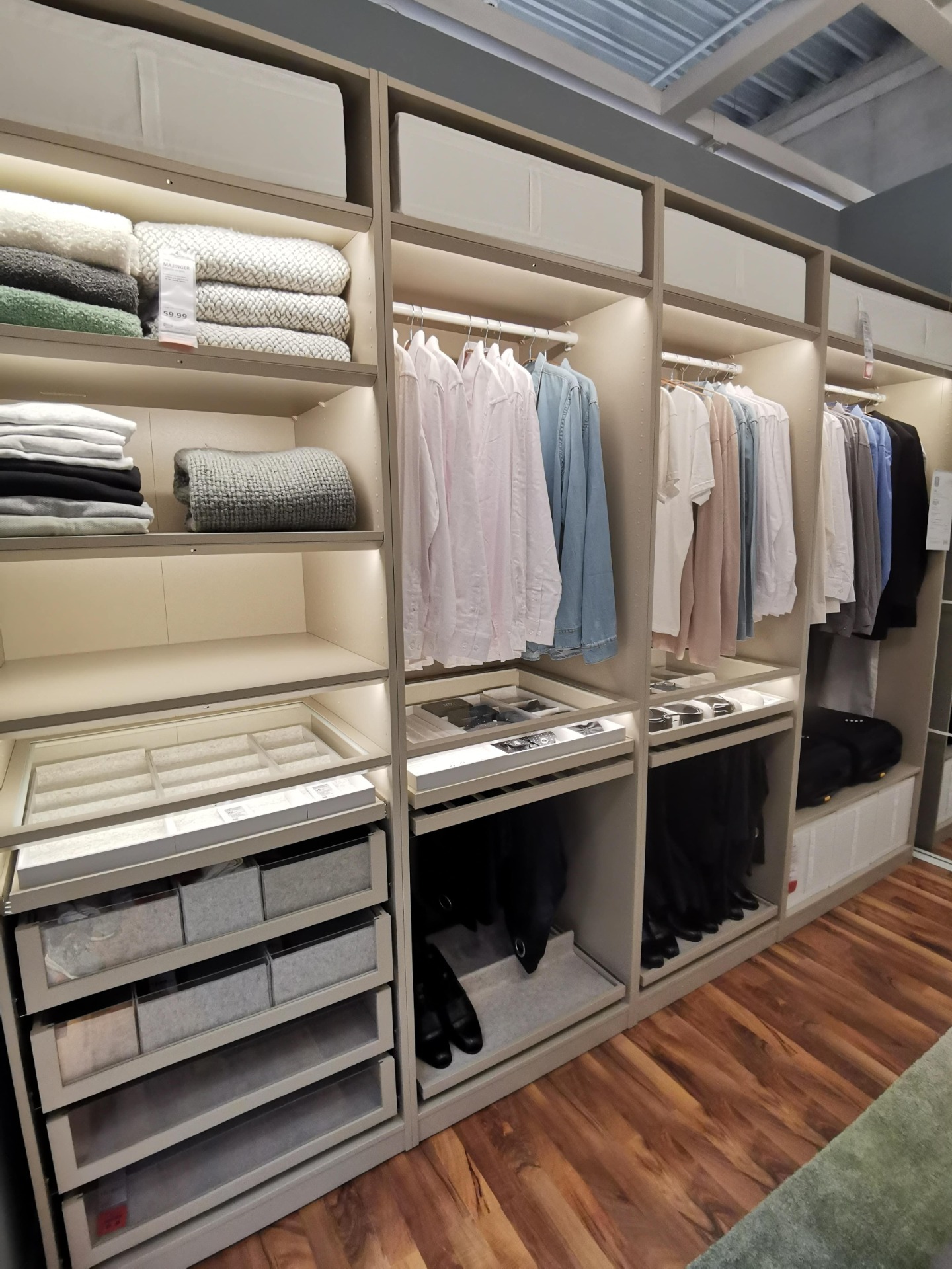
When you step inside IKEA's wardrobe displays, one thing becomes clear: the PAX system is designed to give you structure and order. As you can see in this example, every shelf, drawer and rail has its place – making it easy to imagine how it would look in your own home.
The VOXTORP dark gray kitchen from IKEA is the perfect choice for those who love modern, minimalist design. With its sleek, handle-free fronts and matte finish, it creates a clean and sophisticated look that suits both contemporary and industrial-style homes. The deep gray tone adds a sense of elegance while remaining neutral enough to complement a...
If you're looking for a sleek and stylish kitchen design, then the VOXTORP dark gray kitchen series from IKEA is definitely worth considering. The VOXTORP series is known for its clean lines and minimalistic design, which is perfect for those who prefer a modern and streamlined look.
Many people are searching for color codes for IKEA kitchen fronts, but they can be difficult to find. To ensure accuracy, it is important to rely on a trustworthy source—in this case, IKEA. At the bottom of this article, you will find color codes for discontinued METOD fronts.
