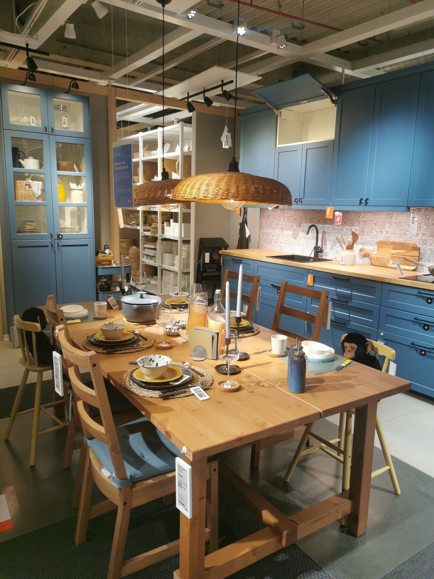
The LERHYTTAN kitchen in blue is one of IKEA's most character-rich kitchen fronts, blending classic craftsmanship with a slightly rustic, Scandinavian feel. During my visit to IKEA Stuttgart, I filmed two different LERHYTTAN blue kitchen setups, each showing a distinct interpretation of the same front.
NCS S 1002-Y: A Timeless Warm Grey

NCS S 1002-Y is a soft, warm grey with subtle yellow undertones, making it a versatile choice for various interior styles. Its balanced hue brings warmth without overpowering, creating a serene and inviting atmosphere in any room.
🔍 Color Specifications
-
NCS Code: S 1002-Y
-
Hex: #dedcd2
-
RGB: 222, 220, 210
-
CMYK: C 0% | M 1% | Y 5% | K 13%
-
HSV: H 0.14 | S 0.05 | V 0.87
These specifications highlight its lightness and subtle warmth, making it suitable for spaces where a gentle, neutral backdrop is desired.

🏠 Ideal Applications
NCS S 1002-Y is perfect for:
-
Living Rooms: Creates a cozy and welcoming environment
-
Bedrooms: Offers a calming and restful ambiance
-
Kitchens: Complements both modern and traditional cabinetry
-
Bathrooms: Provides a clean and fresh look
Its adaptability allows it to pair well with various materials like wood, metal, and textiles, enhancing the overall aesthetic of the space.
🎨 Comparable Shades from Other Brands
If you're seeking similar hues from other paint manufacturers, consider the following options:
-
Benjamin Moore – Going to the Chapel: A soft, warm white with subtle grey undertones, offering a serene and elegant feel
-
Dulux – Thimble Case: A gentle warm grey that adds sophistication to any room
-
Farrow & Ball – Cornforth White: A balanced grey that sits comfortably between warm and cool tones, ideal for creating a relaxed atmosphere
-
Sherwin-Williams – Filmy Green: A muted green-grey that brings a touch of nature indoors
These alternatives provide similar warmth and neutrality, allowing flexibility in choosing the perfect shade for your space.
🖼️ Visual Inspiration
To better visualize how NCS S 1002-Y and its comparable shades look in real settings, explore interior examples, sample boards, or real-room applications. Seeing the colors in context can aid in making an informed decision for your project.
Choosing the perfect kitchen system is one of the most important decisions when designing your home. IKEA offers two popular options: METOD and ENHET. While both provide stylish and functional solutions, they cater to different needs in terms of customization, durability, and budget.
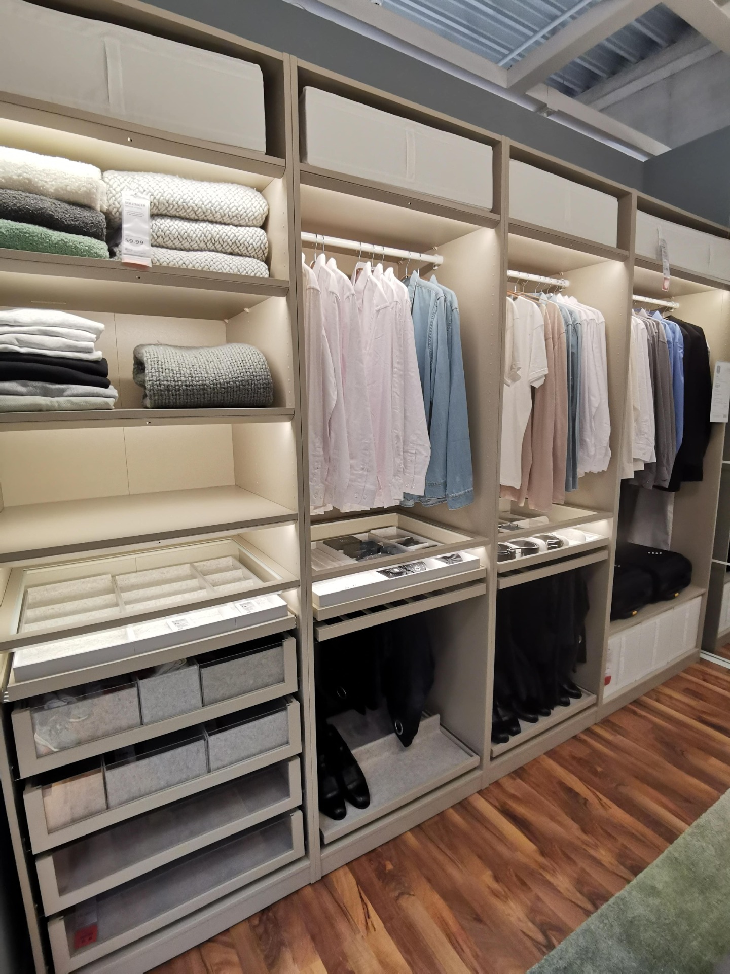
When you step inside IKEA's wardrobe displays, one thing becomes clear: the PAX system is designed to give you structure and order. As you can see in this example, every shelf, drawer and rail has its place – making it easy to imagine how it would look in your own home.
The VOXTORP dark gray kitchen from IKEA is the perfect choice for those who love modern, minimalist design. With its sleek, handle-free fronts and matte finish, it creates a clean and sophisticated look that suits both contemporary and industrial-style homes. The deep gray tone adds a sense of elegance while remaining neutral enough to complement a...
If you're looking for a sleek and stylish kitchen design, then the VOXTORP dark gray kitchen series from IKEA is definitely worth considering. The VOXTORP series is known for its clean lines and minimalistic design, which is perfect for those who prefer a modern and streamlined look.
Many people are searching for color codes for IKEA kitchen fronts, but they can be difficult to find. To ensure accuracy, it is important to rely on a trustworthy source—in this case, IKEA. At the bottom of this article, you will find color codes for discontinued METOD fronts.


